cobra
museum
keeping the movement alive
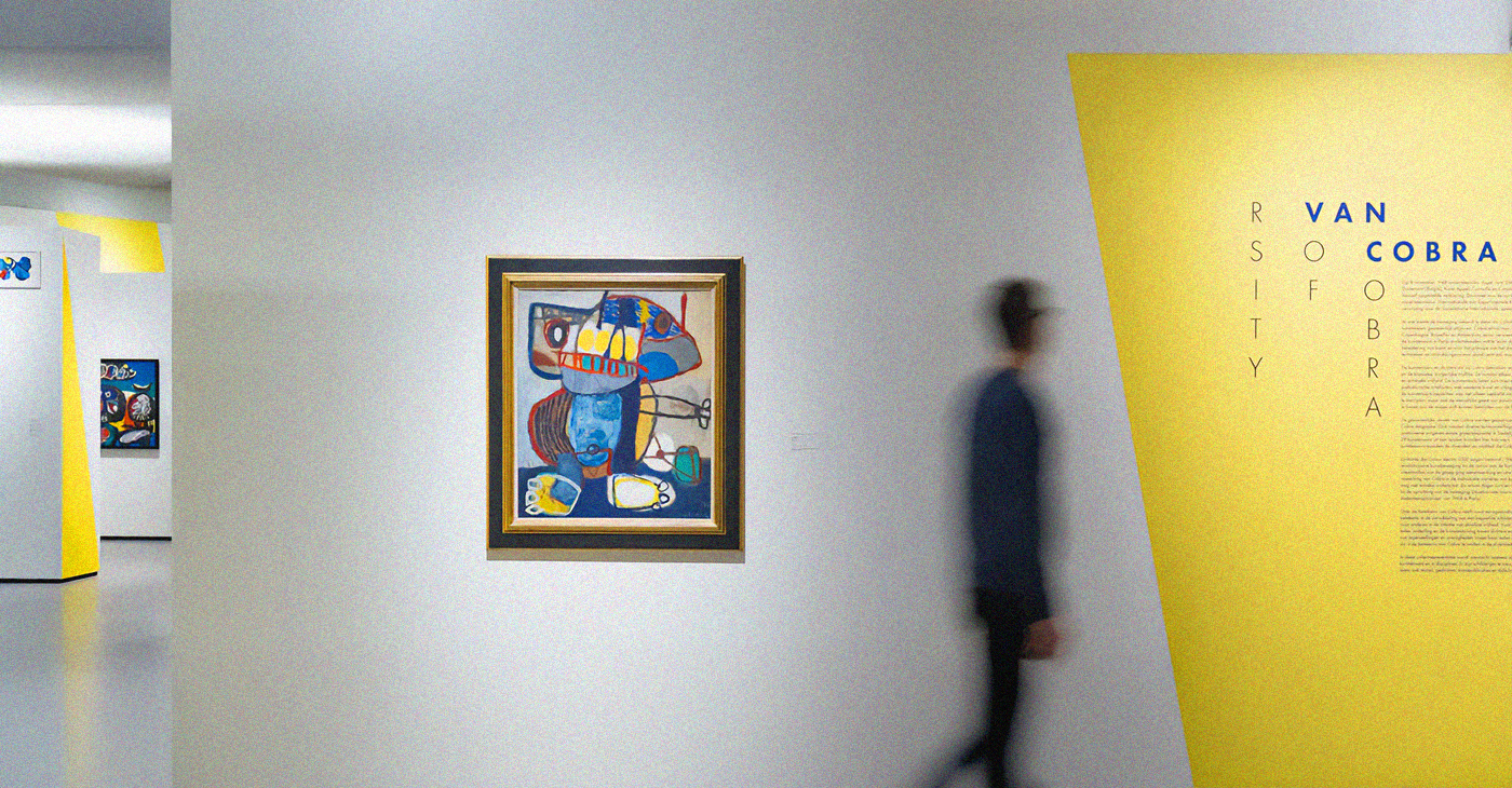
A reimagined identity for the Cobra Museum of Modern Art in Amstelveen, home of the post-war collective that painted with total freedom, colour and experimentation.
A flexible system built to move, react and play, keeping the spirit of Cobra alive, but through a clean and contemporary lens.
bold,
uneven,
alive
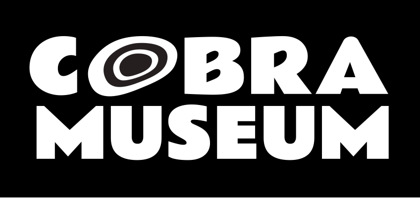
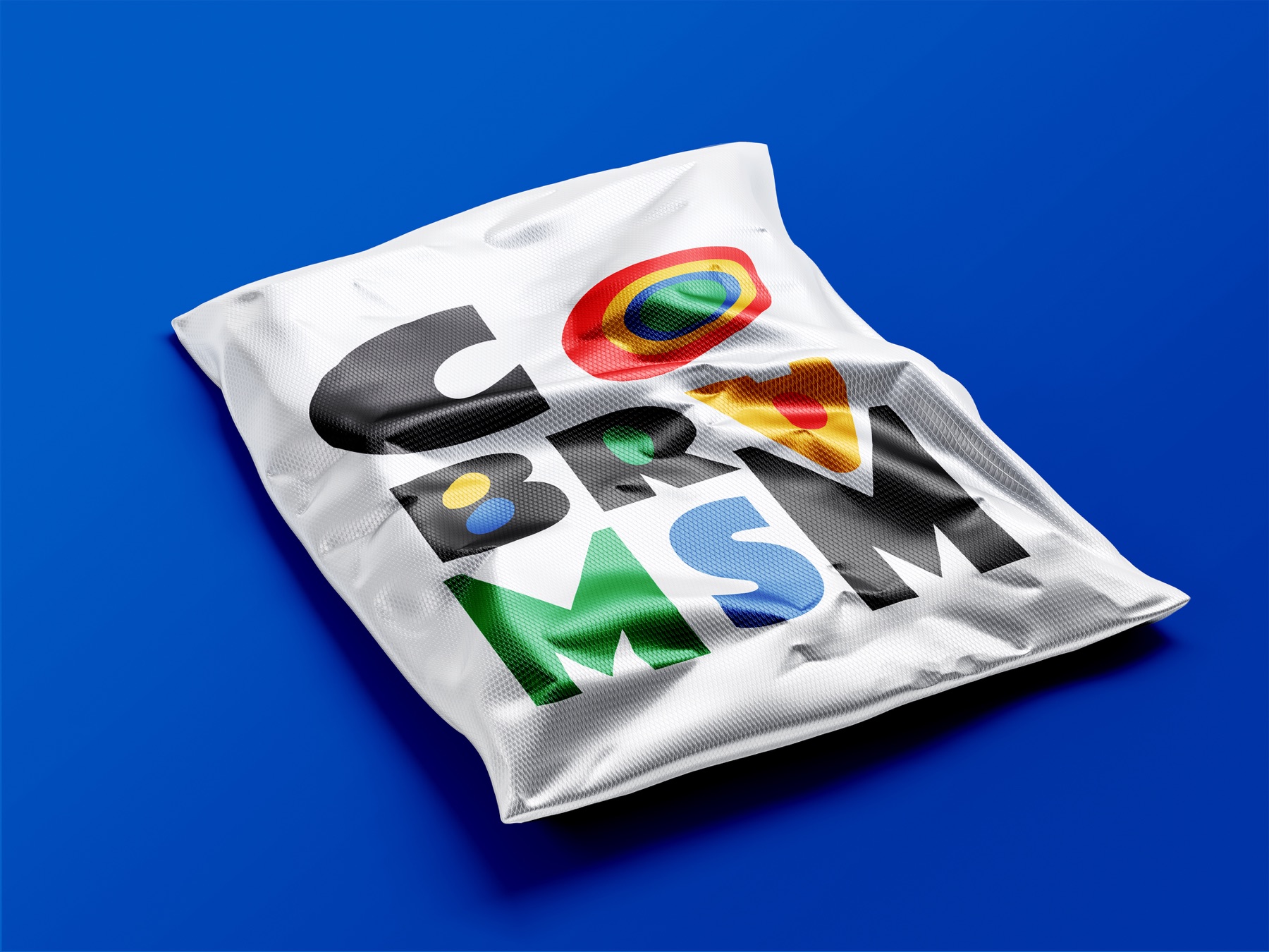
The logo reflects the vibrant and rebellious spirit of the Cobra movement through bold, uneven letterforms that echo the artists’ spontaneous strokes.
Oversized letters introduce rhythm and hierarchy, echoing the movement’s rule-breaking energy.
one logo,
many moods
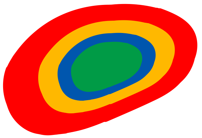
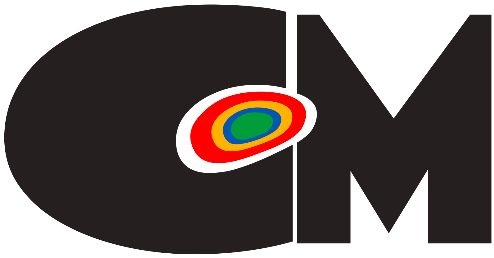
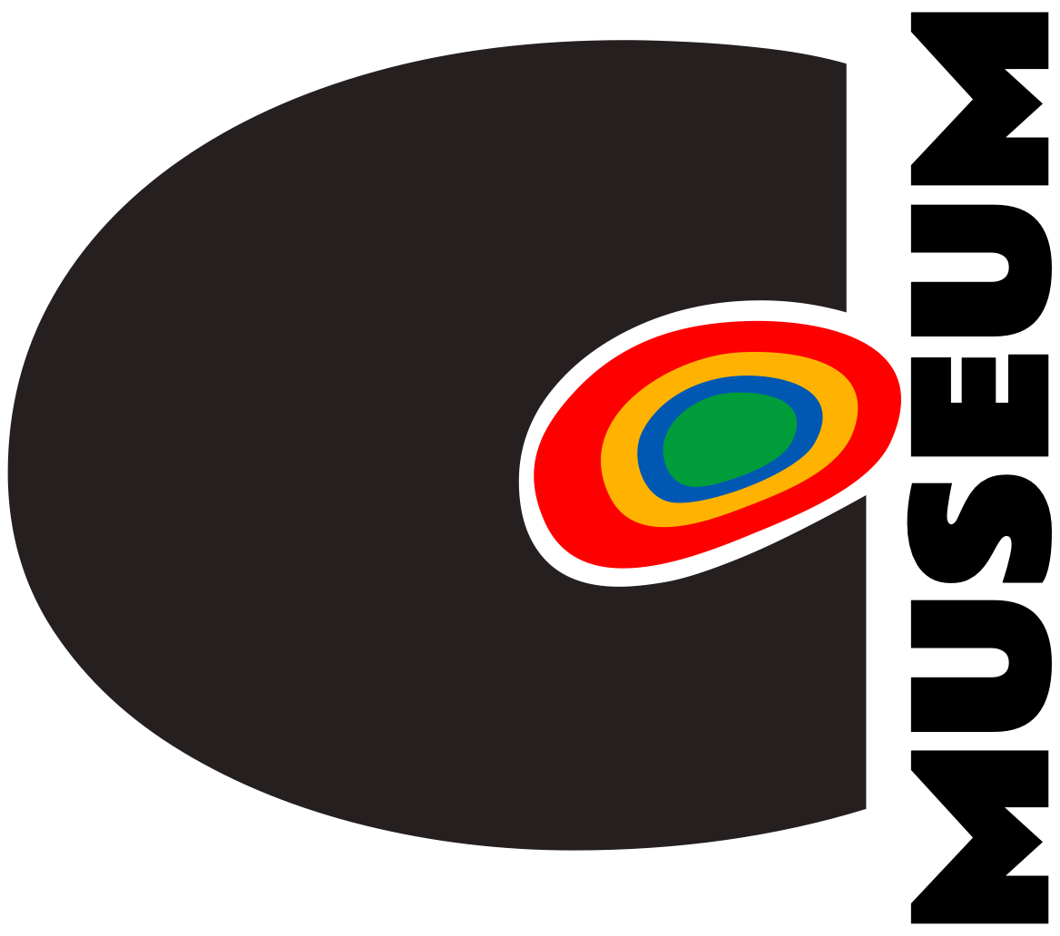
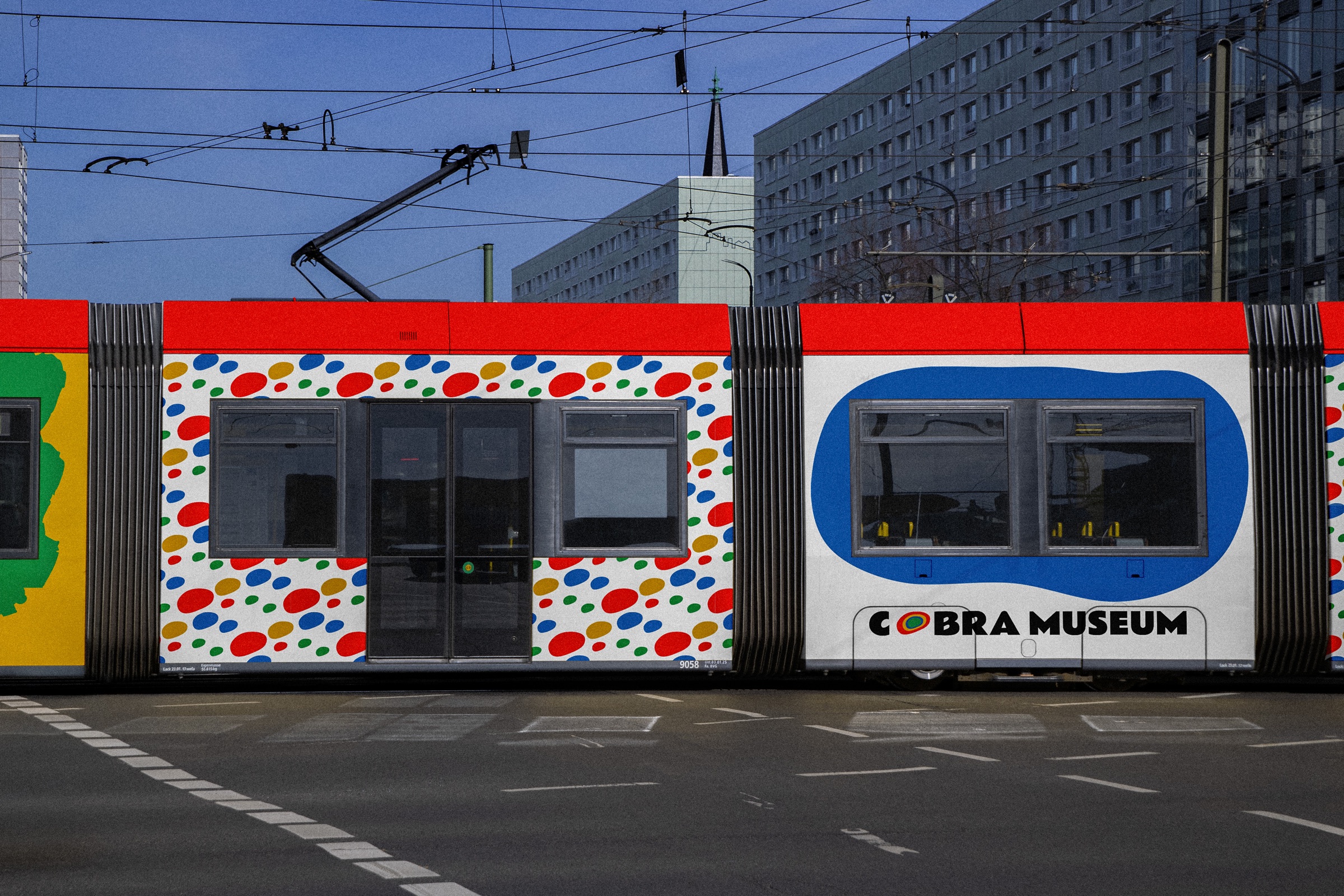
Its circular symbol comes from the negative space inside the “C”, symbolizing the creative core of the collective, always open and in motion. It shrinks to a CM, stands up as C MUSEUM, or plays alone.


colours
that shout
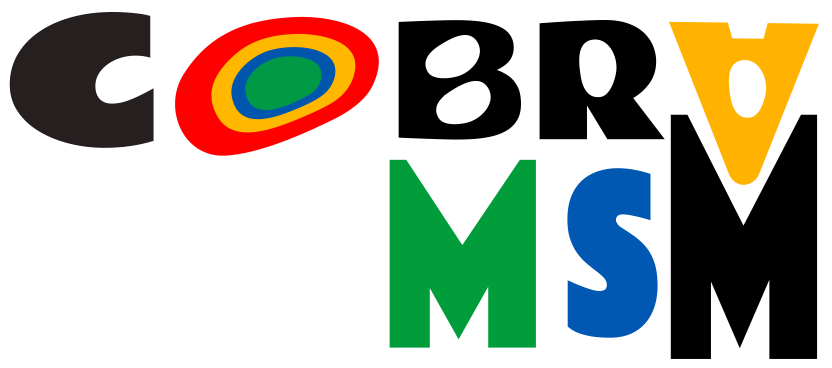
The vivid colour palette draws from Cobra paintings, capturing their freedom, emotion and fearless experimentation.
Pantone 1795 C#E93323
Pantone 123 C#F4BA40
Pantone 286 C#2355A7
Pantone 348 C#00984F
chaos under
control
The typography mix brings contrast and personality: Barrio Regular adds the handmade, expressive side, while Montserrat adds balance and readability.
Montserrat the control: balance, readability
little
characters
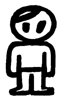
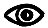
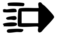
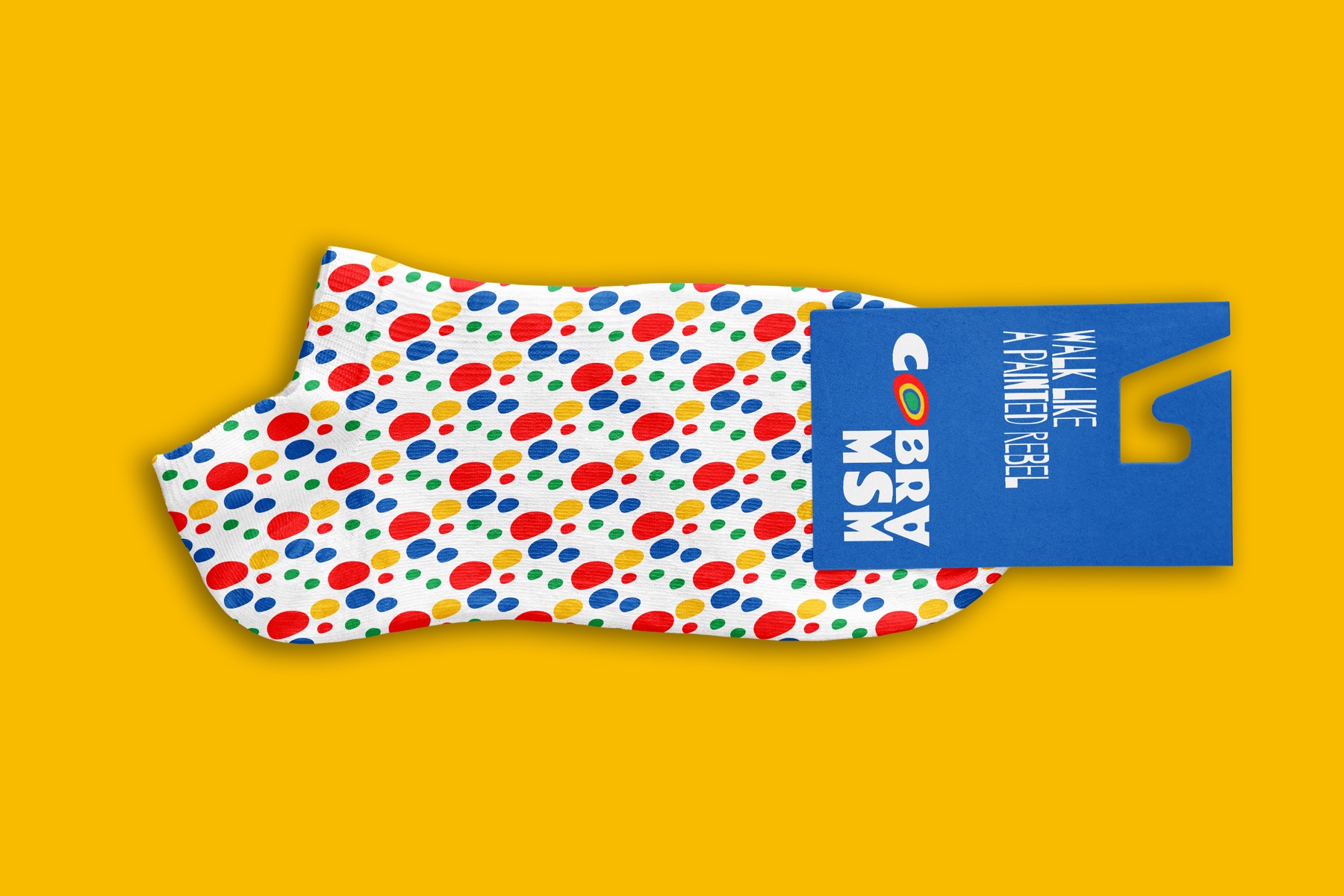
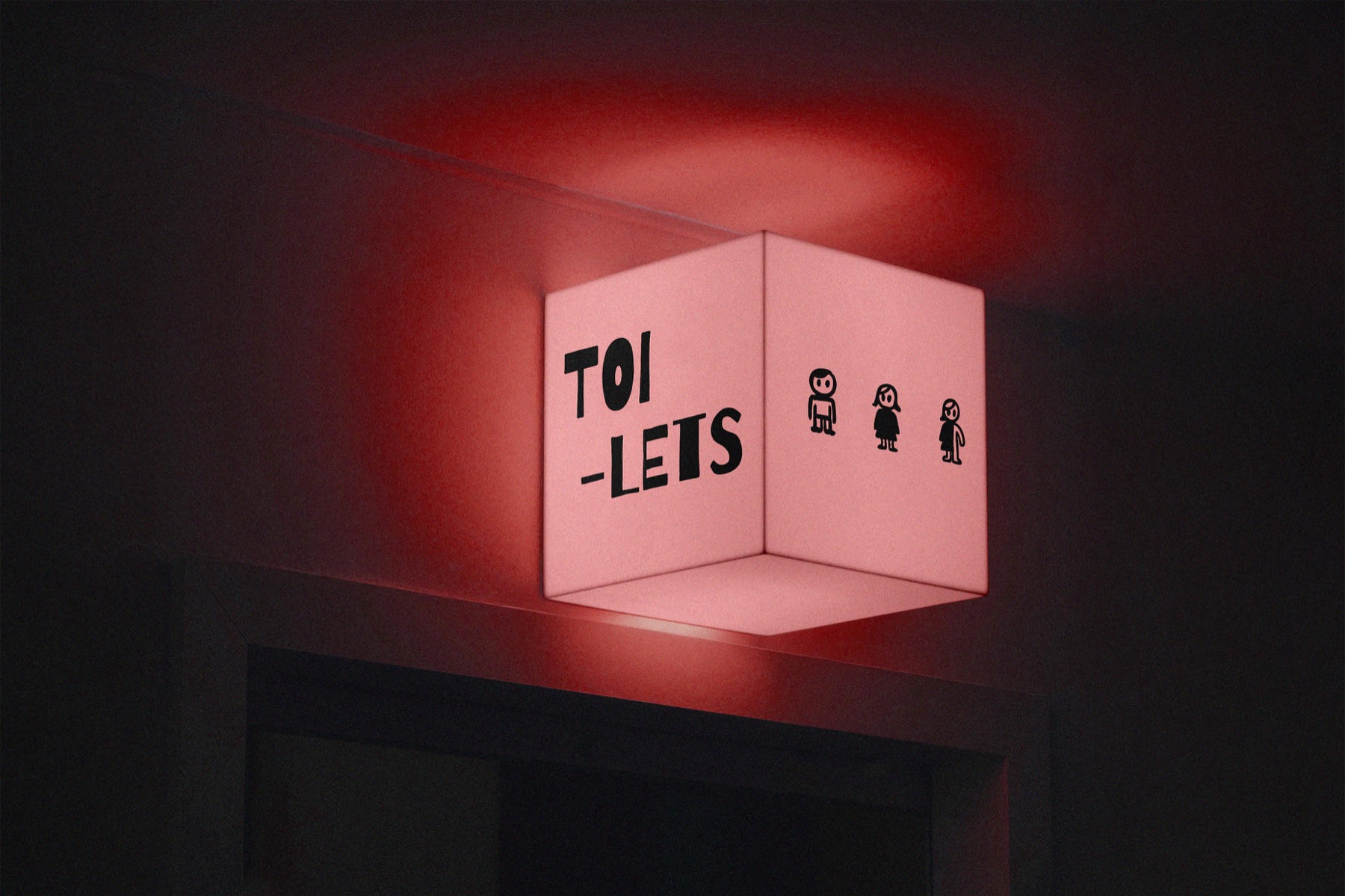
The system mixes hand-drawn shapes and bold colours with a clean structure. The icons follow the same playful mood, simple but full of character.






a walk through
the museum
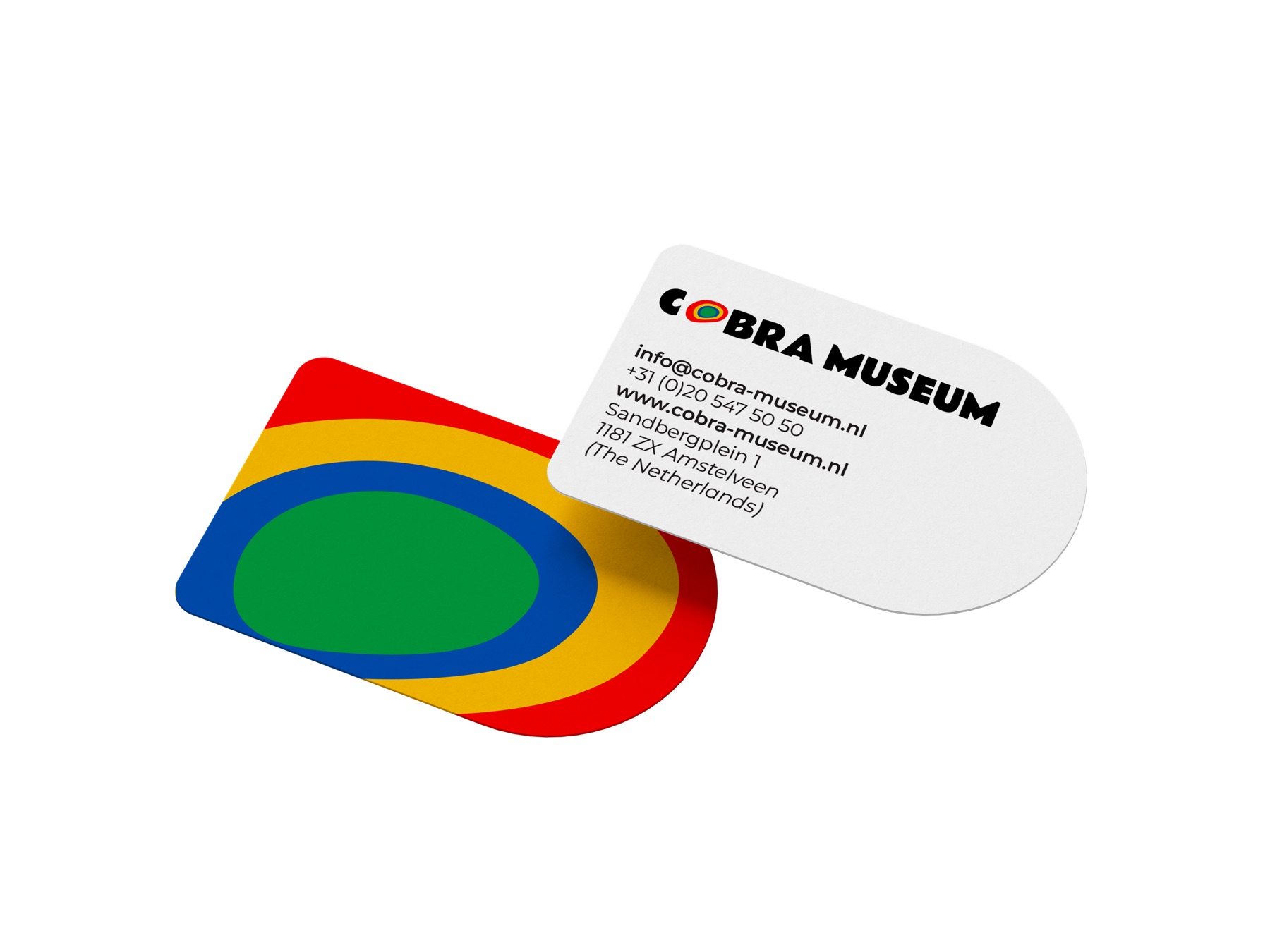
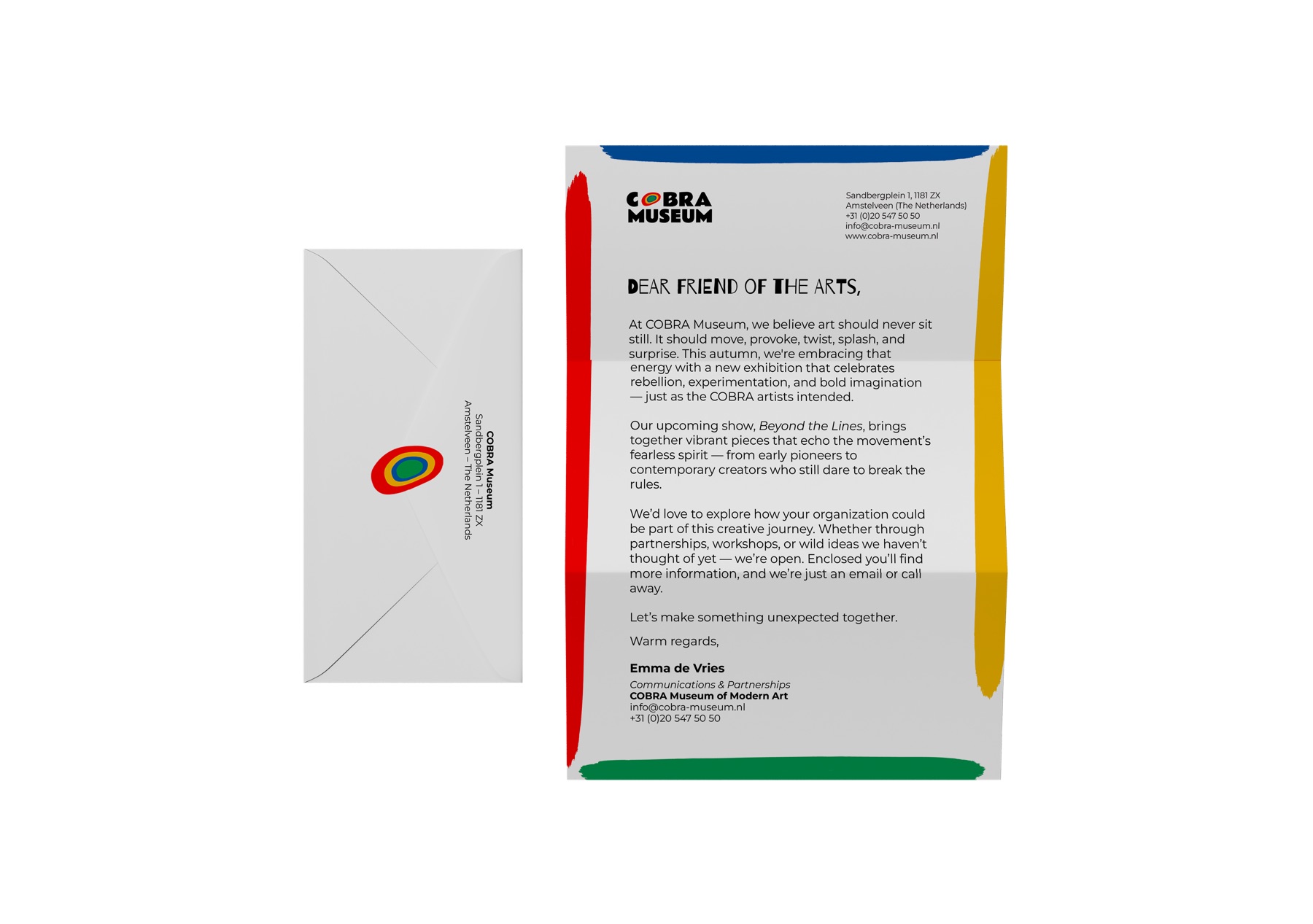
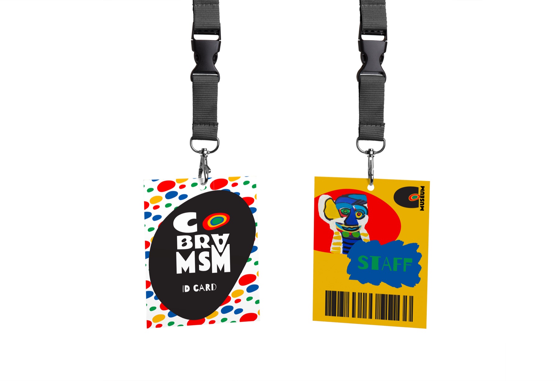
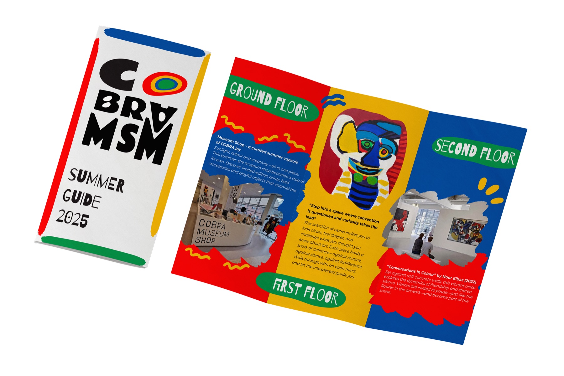
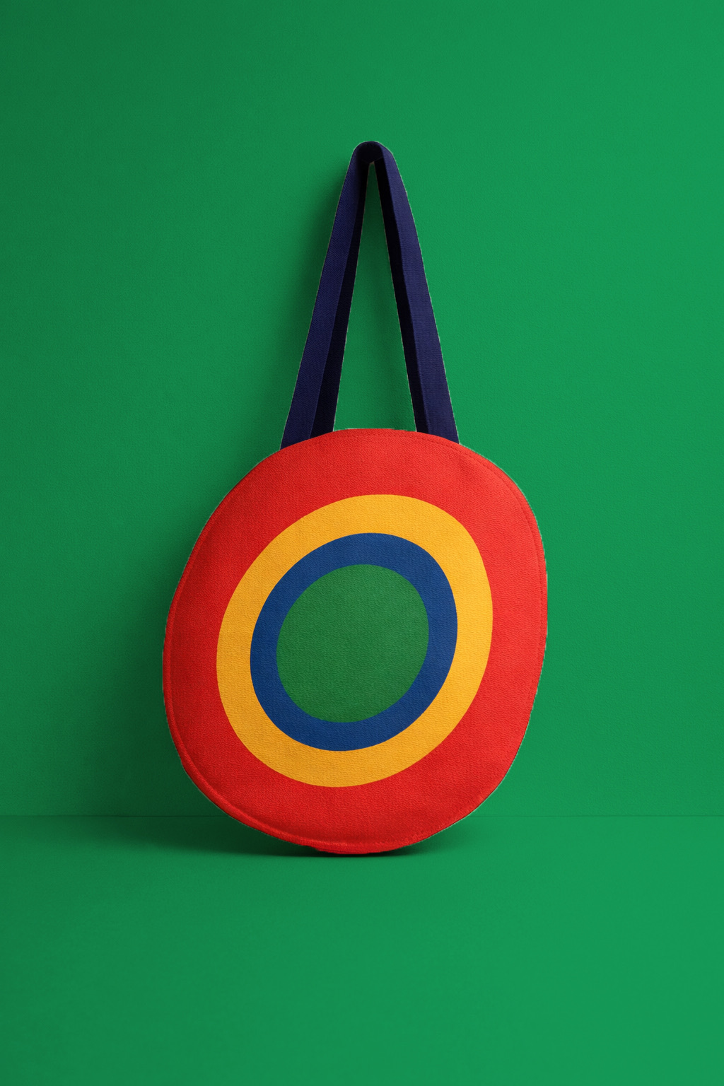
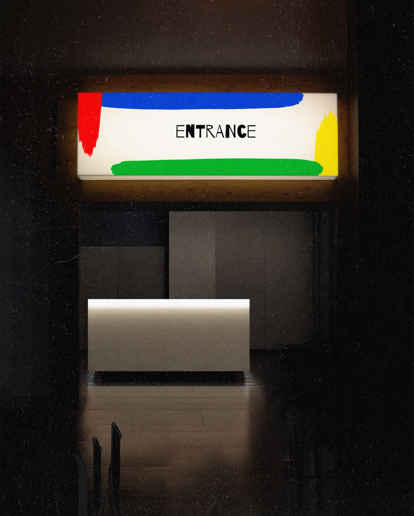
Together, they build the base for everything that comes next: the applications. From your pocket to the front door.
created in
aug 2025
- Ps
- Ai
 fly me up!